Understanding the Sharpe Ratio
Why a 20 percent return tells you almost nothing
Picture two friends bragging about their year in the market. Both made 12 percent. One of them got there with a steady climb that barely wobbled. The other rode a roller coaster, up 15 one month, down 12 the next, white-knuckling it the whole way before scraping across the same finish line. They have identical returns. They did not run the same race.
That gap is the thing return numbers refuse to show you, and it is exactly what the Sharpe ratio was built to expose. The question it asks is almost embarrassingly simple. For every unit of risk you stomached, how much extra reward did you actually walk away with?
This post walks through what the number means, how to compute it on the back of a napkin, how to read it without fooling yourself, and the handful of situations where it quietly lies. There are a few charts along the way, because some of this lands faster as a picture than a paragraph.
The idea in one sentence
The Sharpe ratio, named for economist William Sharpe who introduced it back in 1966, measures how much return you earned above a safe baseline, divided by how bumpy the ride was getting there.
The safe baseline matters. Anyone can park cash in a short-term Treasury bill and collect the so-called risk-free rate without breaking a sweat. So the only return worth crowing about is the part that sits above that. Earn 12 percent when cash pays 4, and your real prize for taking risk was the 8 points on top, not the headline 12. The Sharpe ratio takes that 8 and asks what it cost you in white knuckles.
The formula, and what each piece is doing
Sharpe Ratio = (Rp − Rf) / σp
Rp is the return of your portfolio. Rf is the risk-free rate. And σp, the Greek letter sigma, is the standard deviation of the portfolio's returns, which is just a statistician's way of measuring how much those returns bounce around their average.
The top of the fraction is your reward. The bottom is your risk. Reward over risk. A bigger number means you squeezed more return out of every bit of turbulence you put up with, and that is the whole point of the exercise.
A couple of housekeeping notes that trip people up. The risk-free rate is usually the yield on something short and boring like a 3-month Treasury bill. Standard deviation comes from a string of returns, often monthly or daily. And because those returns are measured over chunks of time, the final ratio almost always gets scaled to a yearly figure so you can compare one thing to another. More on that scaling in a minute.
A first worked example
Say a portfolio returned 12 percent on the year. Cash paid 4. And the portfolio's returns had a standard deviation of 10 percent.
Subtract the 4 from the 12 and you get 8 points of excess return. Divide that 8 by the 10 percent of volatility and you land on a Sharpe ratio of 0.8.
On its own, 0.8 is just a number. It comes alive the moment you put a second portfolio next to it.
Same return, different risk
Here is where the ratio earns its keep. Take two portfolios that both returned 12 percent. The first had a standard deviation of 10 percent, giving us the 0.8 from above. The second was far calmer, with a standard deviation of just 5 percent. Run the math and its Sharpe ratio is 1.6.
Same return. Double the efficiency. The second portfolio paid you the same 8 points of excess return while asking for half the stomach lining.
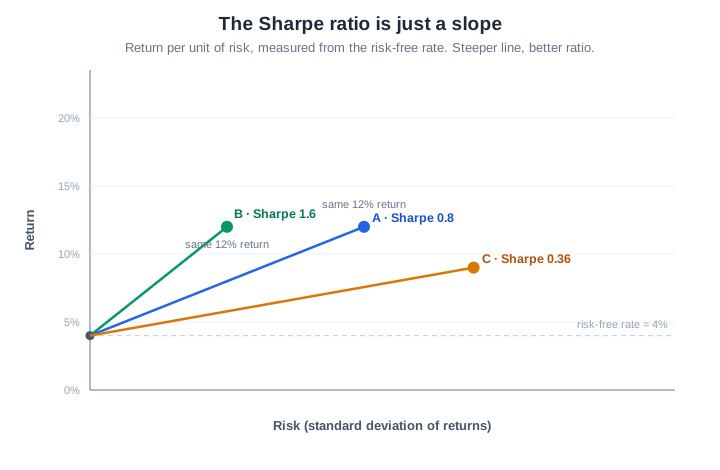
That chart is worth sitting with, because it shows what the Sharpe ratio really is under the hood. Plot risk along the bottom and return up the side. Start at the risk-free rate on the left axis. Now draw a line out to each portfolio. The slope of that line is the Sharpe ratio. Steeper slope, better deal. Portfolio B climbs faster for every step to the right, which is another way of saying it gives you more return per unit of risk. Portfolio C, off to the lower right, took on more risk for less return, and you can see its sad little slope is the shallowest of the three.
| Portfolio | Return | Risk-free rate | Std. deviation | Sharpe ratio |
|---|---|---|---|---|
| A | 12% | 4% | 10% | 0.80 |
| B | 12% | 4% | 5% | 1.60 |
| C | 9% | 4% | 14% | 0.36 |
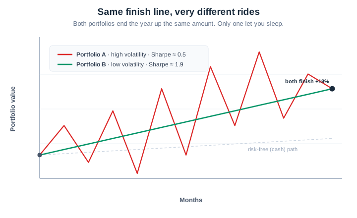
The same lesson shows up if you watch the journey instead of the destination. Below, two portfolios both finish the year up 18 percent. One glides. The other lurches around like it owes someone money. Identical return, wildly different Sharpe, and you already know which one you would rather have actually held.
Reading the number without kidding yourself
There is no official scoreboard, but practitioners lean on some rough rules of thumb.
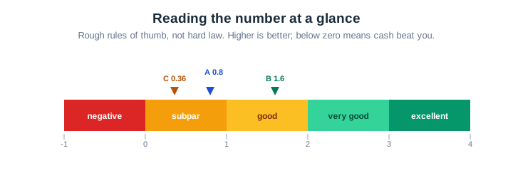
Below 1 is generally weak. You are not being paid much for the risk you are carrying. Between 1 and 2 is solid. Between 2 and 3 is genuinely good and harder to sustain. Above 3 is rare air over any long stretch, and when you see it advertised you should get a little suspicious rather than impressed. A negative Sharpe ratio is the saddest case of all. It means your risky bet did worse than cash, and you would have been better off doing nothing.
Treat these bands as guideposts, not gospel. The ratio is at its best as a head-to-head tool. Line up two strategies over the same window, using the same risk-free rate and the same return frequency, and the higher Sharpe tells you which one delivered more bang per unit of risk. Compared that way, it is hard to argue with. Held up against some absolute standard in isolation, it gets shaky fast, because you can nudge the result around just by changing the dates or the data.
A real-world style comparison
Numbers in a vacuum are easy. Let us make it feel more like a brokerage statement. Three funds, one year, cash paying 4 percent the whole time.
| Fund | Return | Std. deviation | Sharpe ratio |
|---|---|---|---|
| Aggressive Growth | 18% | 22% | 0.64 |
| Balanced | 11% | 9% | 0.78 |
| Steady Income | 7% | 4% | 0.75 |
Now look at what happens. Aggressive Growth posts the fattest return by a mile, 18 percent, and any marketing brochure would lead with that. But its Sharpe ratio is the worst of the three. All that return came soaked in volatility. The unglamorous Balanced fund, with its middling 11 percent, actually delivered the best risk-adjusted result. And Steady Income, the one your retired aunt owns, nearly ties it despite earning less than half as much.
This is the entire reason the ratio exists. The loudest return in the room is very often not the smartest one once you account for what it put you through.
Annualizing, briefly
Because returns usually get measured monthly or daily, the raw ratio has to be stretched to a yearly figure before any comparison is fair. The convention is to multiply the periodic Sharpe by the square root of how many periods fit in a year. For monthly data that is the square root of 12, about 3.46. For daily data using trading days it is the square root of 252, about 15.9.
Quick example. Suppose a strategy averages 0.7 percent of excess return a month with a monthly standard deviation of 2.5 percent. The monthly Sharpe is 0.7 divided by 2.5, or 0.28. Multiply by 3.46 and the annualized Sharpe is roughly 0.97.
Why the square root and not just plain 12? Because returns pile up over time while volatility grows more slowly, at the rate of the square root of time, at least when each period's return is independent of the last. Hold onto that assumption, because it is one of the cracks the ratio can fall through.
Where the Sharpe ratio lies to you
The formula is clean. Markets are not. Every assumption baked into the ratio is a place where the number can flatter a bad strategy or punish a good one.
The first and biggest sin is that it treats all volatility as bad, full stop. Standard deviation does not care whether a return jumped up or crashed down. It just measures the size of the swing. So a fund that occasionally rockets higher gets dinged for that good behavior exactly as hard as a fund that occasionally craters. Nobody has ever lost sleep over an unexpected gain, yet the math frowns at both the same way.
The second sin is subtler and more dangerous. The ratio assumes returns follow a normal distribution, the familiar bell curve where extreme events are vanishingly rare. Plenty of real investments do not behave like that at all. They have fat tails, meaning the once-in-a-decade disaster shows up far more often than the bell curve promises.
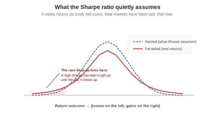
Picture a strategy that quietly sells insurance against market crashes. Most months it pockets a small, smooth premium. The returns look gorgeous and the Sharpe ratio climbs, because there is so little volatility to divide by. Then the crash it was insuring against finally arrives and the whole thing detonates. The very smoothness that produced the beautiful number was the danger, hiding in the left tail where standard deviation never thought to look. A high Sharpe on a strategy like that is not reassurance. It is a warning you have to know how to read.
A few smaller gremlins round out the list. The ratio is easy to dress up by cherry-picking a flattering time window, since stretching returns over longer periods makes volatility look tamer. It says nothing about leverage buried inside a strategy. And the answer wobbles depending on which risk-free rate you pick, which is not always obvious.
The cousins that fix specific flaws
Because of these gaps, a small family of related ratios has grown up, each one patching a particular weakness.
The Sortino ratio answers the complaint about punishing the upside. Instead of total volatility in the denominator, it uses downside deviation, counting only the returns that fall below some target. Upside swings stop counting against you. Take a fund returning 10 percent against a 4 percent risk-free rate with 12 percent total volatility. Its Sharpe is 0.50. But if most of that volatility was to the upside and the genuine downside deviation was only 7 percent, the Sortino ratio jumps to 0.86. Same fund, fairer grade, because it stopped penalizing the good kind of bumpiness.
The Treynor ratio swaps total volatility for beta, which measures only how much a holding moves with the broader market. It is the right lens when an investment lives inside an already diversified portfolio, where the only risk that still matters is the part you cannot diversify away.
The Calmar ratio ignores volatility entirely and divides return by the maximum drawdown, the worst peak-to-trough fall over the period. It speaks to the pain an investor actually feels, because drawdown, not standard deviation, is what makes people panic and sell at the bottom.
| Measure | What sits in the denominator | When to reach for it |
|---|---|---|
| Sharpe ratio | Total standard deviation | Broad risk-adjusted comparison |
| Sortino ratio | Downside deviation only | Returns are lopsided or skewed |
| Treynor ratio | Beta (market risk) | Holding sits inside a diversified portfolio |
| Calmar ratio | Maximum drawdown | You care most about the worst loss |
How to actually use it
Use the Sharpe ratio the way a mechanic uses a single gauge. It tells you something real, but you would never rebuild the engine off one reading.
Keep your comparisons honest. Same risk-free rate, same return frequency, same time window across everything you stack up, then read the results as a ranking rather than a verdict carved in stone. When a strategy posts a suspiciously high ratio on the back of small steady gains, treat that as a reason to dig harder, not relax. And always pair it with at least one drawdown-aware measure, because the path your money takes matters every bit as much as the tidy efficiency number at the end. The people who blow up are usually the ones who watched the Sharpe ratio and ignored the tail.
Used with that bit of skepticism, it remains the most quoted risk-adjusted return metric in all of finance, and deservedly so. It takes the fuzzy idea of good returns for the risk and turns it into one number you can actually compare. Just never forget what that number politely declines to mention.
This piece is for informational purposes only and is not investment advice. Risk metrics describe the past and can mislead; check current data and lean on more than one measure before making any decision.